
Event Colour Schemes and What Each Colour Says
One of the first questions clients ask is which colour to go for. It sounds like a simple question, but it never is. Colour does far more than look nice. It sets the mood before anyone has said a word, and it is the first thing guests read as they walk through the door.
Private parties tend to follow personal taste, and corporate events often have no colour scheme at all beyond the brand palette. Either way the useful questions are the same: which colours suit the intended mood, which ones should you avoid and how much of each to actually use.
Below is how Funky Event Hire approaches it, along with the props and furniture to support each colour theme.
Event Colours at a Glance
| Colour | What it says | Best for |
|---|---|---|
| White | Clean, fresh, spacious | Summer parties, launches, small venues |
| Black | Glamour, elegance, power | Black tie, awards, Gatsby, Bond |
| Red | Heat, drama, energy | Vegas, burlesque, masquerade |
| Yellow | Cheerful, warm, attention grabbing | Daytime and outdoor events |
| Pink | Warm, romantic, playful | Birthdays, baby showers, photo led events |
| Green | Natural, calm, restful | Chill out zones, networking, woodland |
| Orange | Energetic, sociable, fun | Charity events, launches, autumn |
| Purple | Luxury, mystery, theatre | Bars, chill out lighting, Arabian |
| Blue | Trust, calm, professional | Conferences, awards, winter and ice |
| Gold | Celebratory, expensive | Any event needing one strong accent |
| Silver | Modern, sharp, cool | Launches, winter, contemporary venues |
| Jewel tones | Rich, indulgent | Autumn and winter, difficult venues |
| Neutrals | Relaxed, unfussy | Daytime, summer, rustic briefs |
| Multi-colour | Fun, informal | Fun days, festivals, carnival |
| Neon | High energy, transformative | Late events, younger crowds |
Why Does Colour Matters in Event Design?
Colour is the first and fastest impressions that guests make about a room. Before they have found their table or got a drink, they have already read the space as warm or cool, relaxed or formal, fun or serious.
That initial impression comes from the big features rather than the smaller details, which is why wall draping, ceiling draping and lighting do far more work than table decor initially. Get those right and the smaller pieces fall into place.
Most of Funky Event Hire’s seating and tables can be painted or upholstered to specification, and the draping and chair covers come in a wide choice of shades, so a colour scheme does not have to mean compromising on the furniture.
What Each Colour Says
White
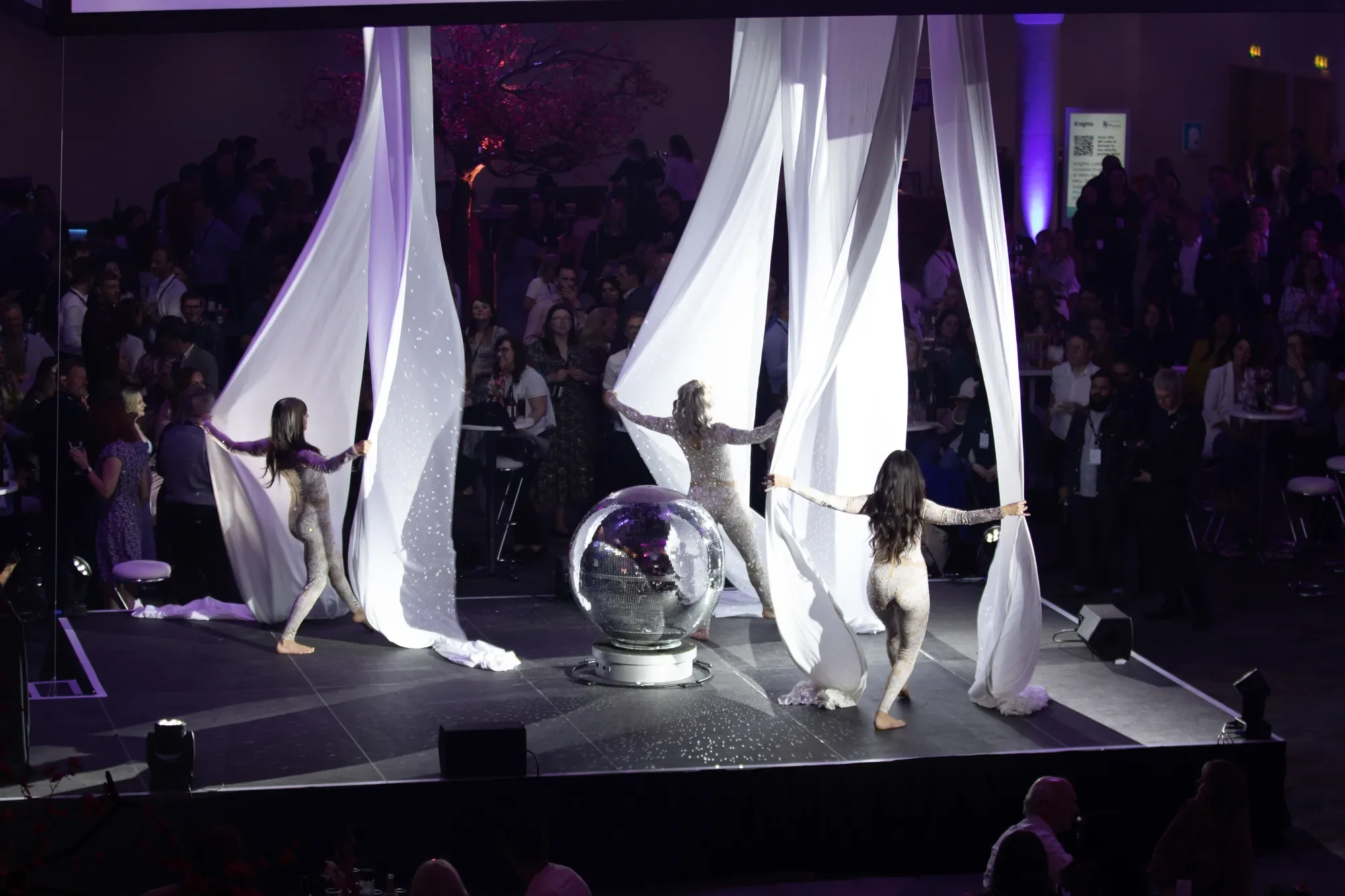
White tends to read as clean, fresh and new. Practically, white is the colour that makes a small or dark venue feel bigger, which is why it works so well for summer parties and product launches.
Used too heavily on its own, a room can feel clinical rather than crisp, therefore it needs texture alongside it.
Props to hire: white ottomans and cube seating, white coffee tables, a white bar, a white dance floor, and white trees from the winter range.
Black
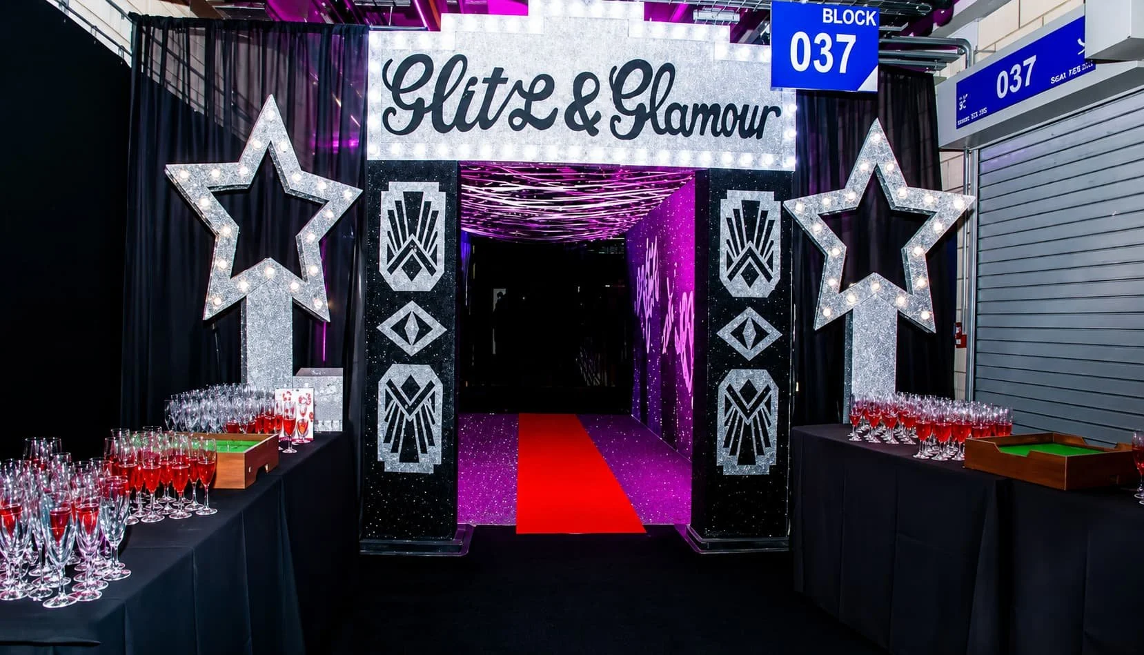
Black is the shortcut to glamour. It reads as elegant, expensive and sophisticated. It also partners very well with golds and metallics. It also carries a darker side, which is exactly why it suits black tie galas at one end and Halloween at the other.
Props to hire: black star cloth, black and gold draping, black Chiavari chairs, a black dance floor and a gold mirror bar. Both the Great Gatsby and James Bond themes are built on it.
Red
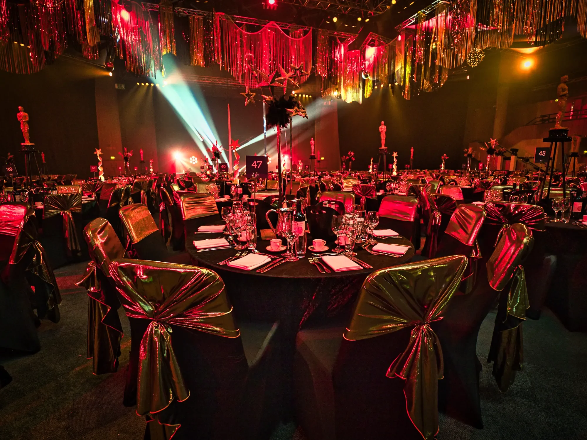
Red is heat, drama and intensity, and it is not a subtle choice. It commands attention and raises the energy of a room, which makes it brilliant for a party and risky for anything that needs a calm, considered atmosphere.
It suits Moulin Rouge, burlesque, Vegas and masquerade themes, where the whole point is theatre.
Props to hire: red velvet draping, red carpet with ropes and stanchions, red and black feather table centres, and the freestanding red and gold masquerade masks.
Yellow
Yellow is cheerful, warm and impossible to ignore, which makes it a natural for daytime and outdoor events. It is also the colour people tire of fastest, so it works best as an accent rather than a scheme.
Against white, black or a multi-colour palette it lifts everything. Across every wall it becomes wearing.
Props to hire: sunflower food stations and British theme styling, festival bunting and festoon lighting, and gold accents where the warmth is wanted without the glare.
Pink
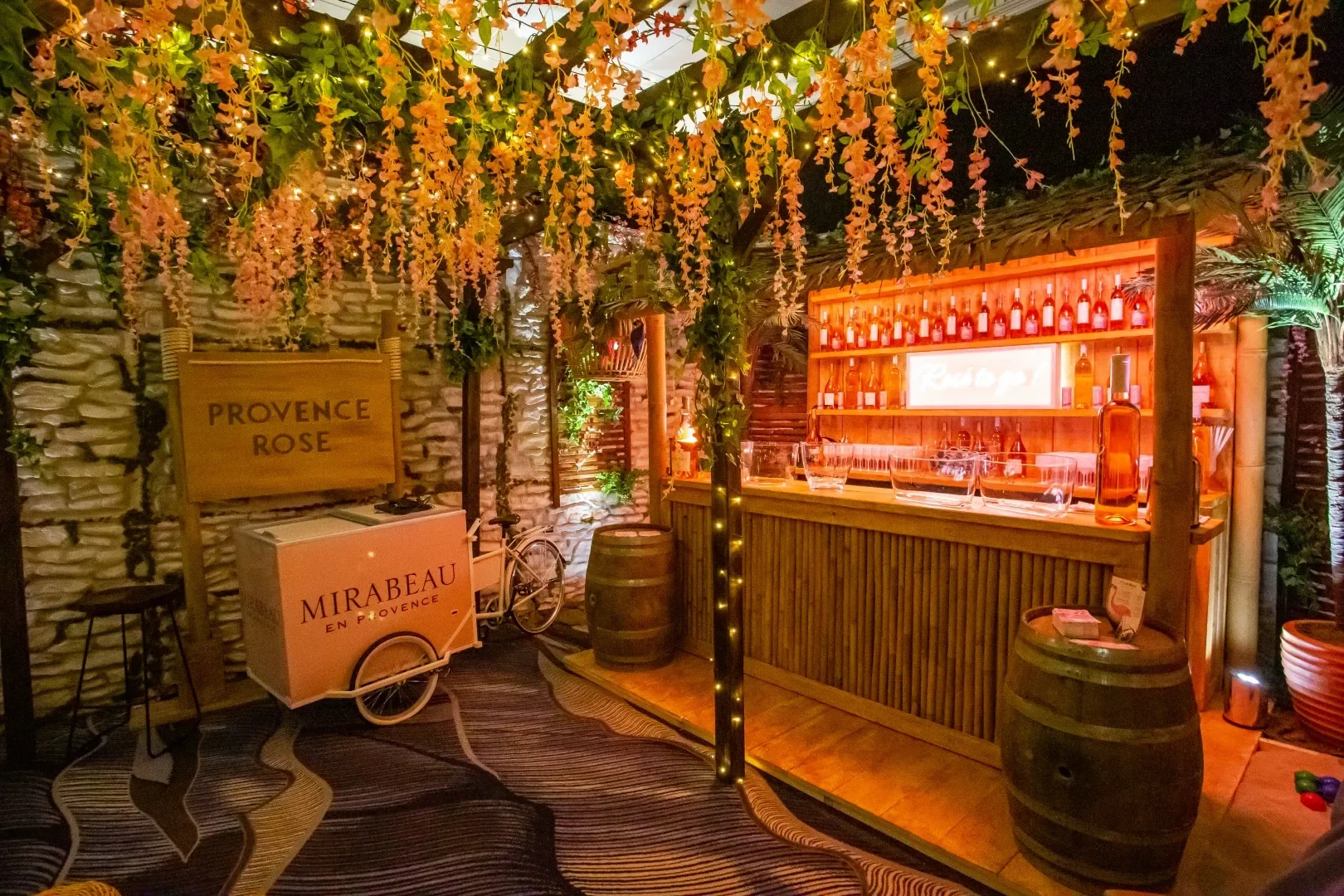
Pink is red with the volume turned down. It reads as warm, caring and romantic, and it has become one of the most requested colours Funky Event Hire works with, largely because it photographs beautifully.
The one caution is corporate. Too much pink in a formal setting can undercut the intended tone, so it is usually better introduced through one or two statement pieces rather than the whole room.
Props to hire: pink blossom trees, pink balloon installations, floral living walls and pink floral table centres.
Green
Green is the calmest colour available in a room. It reads as natural, healthy and restful, which makes it the obvious choice for chill out zones, networking areas and anywhere guests should settle rather than charge about.
It is also the easiest colour to deliver convincingly, because realistic foliage does the job on its own without any lighting trickery.
Props to hire: foliage ceilings, living walls, foliage and trees, a foliage bar and a foliage tunnel entrance. The Enchanted Woodland, Secret Garden and Jungle themes are all built on it.
Orange
Orange is energy and friendliness without the aggression of red. It draws the eye, feels sociable and does not take itself too seriously, which makes it a good fit for charity events, launches and anything that needs the room buzzing.
Props to hire: autumn trees and foliage, carnival draping and bunting, multi coloured feather table centres and colour changing LED furniture.
Purple
Purple signals luxury, mystery and a bit of theatre. It looks expensive, particularly in lighting, and a little goes a long way. Across a whole room it can overwhelm, but washed over a chill out area or a bar it is hard to beat.
Props to hire: purple draping from the Willy Wonka range, illuminated bars and colour changing seating, and the rich jewel tones in the Arabian Nights theme.
Blue
Blue reads as trustworthy, dependable and calm, which is why so many corporate brands land on it. It is a safe, professional choice for conferences and awards dinners.
The flip side is that blue can feel cold and keep people at arm’s length, so it needs warmth alongside it. It also comes into its own for ice, underwater and winter themes, where cold is the whole idea.
Props to hire: icy blue uplighting, ice bars and ice stalagmites from the winter wonderland range, and LED furniture set to blue. There is more on this in 6 Blue Themed Decor Ideas.
Gold
Gold is the colour that does the most work for the least effort. It reads as celebratory and expensive, it photographs beautifully under warm lighting, and it sits happily against black, white, green or jewel tones without clashing. Where there is budget for only one accent colour, this is usually the one.
Props to hire: gold Chiavari chairs, a gold mirror bar, gold glam table centres, black and gold draping, gold glitter stars and the gold champagne tower.
Silver and Metallics
Silver is gold’s cooler cousin. It reads as modern, sharp and slightly futuristic rather than traditional, which makes it the better choice for product launches and anything that should feel current. It also pairs naturally with white and icy blue for winter.
Props to hire: a silver bar, silver tree table centres, glitter carpet, ice stalagmites, a mirror disco ball wall and the giant silver star.
Jewel Tones
Deep emerald, sapphire, ruby and plum together read as rich and indulgent in a way no single colour manages on its own. Jewel tones suit autumn and winter events, and they are forgiving in venues with difficult existing décor because they absorb the room rather than fight it.
Props to hire: rich velvet seating and low benches from the Arabian Nights range, red velvet draping, Arabian lanterns and gold accents throughout.
Neutrals and Natural Tones
Wood, hessian, stone and cream read as relaxed and unfussy, and they make the easiest palette to get right because nothing clashes. This is the palette for daytime events, summer parties and anything with a rustic brief.
Props to hire: lime wash Chiavari chairs, rustic trestle tables and benches, barrels, crates, pallet seating, log walls and a pallet bar from the Shabby Chic and Vintage range.
Multi-Colour and Bright Tones
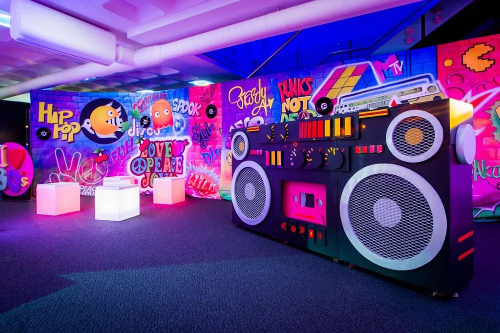
Sometimes the answer is all of them. A deliberately multi-coloured scheme reads as fun, informal and unpretentious, and it is far more forgiving than people expect, because once six colours are in play nobody is checking whether they match.
It suits family fun days, festival and carnival themes and summer parties. The one rule is to keep the base neutral so the colour pops rather than overwhelms.
Props to hire: colourful draping and chair covers, multi coloured feather table centres, balloon arches, bunting ceilings and ribbon draping from the Carnival and Festival ranges.
Neon and UV
Neon is less a colour than an effect. Under UV light, white and fluorescent colours glow and everything else drops away, which transforms a room completely once the evening gets going. Where guests are asked to wear white, they become part of the decor.
It suits younger crowds, late events and anything that needs a second act after dinner.
Props to hire: neon archways, a neon living wall, LED cube seating and poseur tables, an illuminated bar and a retro dance floor from the Neon Jungle range.
What Colours Should I Choose For a Corporate Event
Where there is a brand palette to work to, it is better used for the accents than the whole room. Brand colours on the draping, the chair covers and the walls tends to look like a trade stand. Brand colours on the table centres, the lighting and the letters, against a neutral base, looks deliberate.
Blue, black, green and neutrals are the safest corporate bases. Gold and silver are the safest accents. Red, orange and yellow work better in small doses. Pink and purple are worth a conversation first.
How Much Colour is Too Much
A rough rule is two thirds, one third, a splash. One dominant colour across the big surfaces, a second across the furniture and draping, then a sharp accent in the table centres, lighting or letters.
Three colours fighting for attention in equal measure is where rooms start to look chaotic rather than designed. Where there is doubt, it is better to go bolder on one colour and quieter on the rest.
Event colour FAQs
What colours work best for a corporate event?
The colours that work best for a corporate event are usually blue, black, green or neutrals as the base, because they read as professional and calm, with brand colours and metallics used as accents in the lighting and table centres rather than across the whole room.
What do different colours mean at an event?
Different colours mean different things at an event, broadly: white reads as fresh and spacious, black as glamorous, red as energetic, green as calm, blue as professional, and gold as celebratory. The table above sets out all fifteen colours covered here.
How many colours should an event theme use?
An event theme should generally use two main colours and one accent, with one colour dominating the large surfaces, because three colours used in equal measure tends to look busy rather than designed.
Can props be matched to brand colours?
Props can be matched to brand colours, as most of Funky Event Hire’s seating and tables can be painted or upholstered in a wide range of fabrics and colours, and the draping and chair covers come in a broad choice of shades.
Which colour makes a venue feel bigger?
White makes a venue feel bigger, particularly in small or dark rooms, and pairing it with texture such as faux fur, foliage or draping stops it feeling clinical.